LAC REBRAND
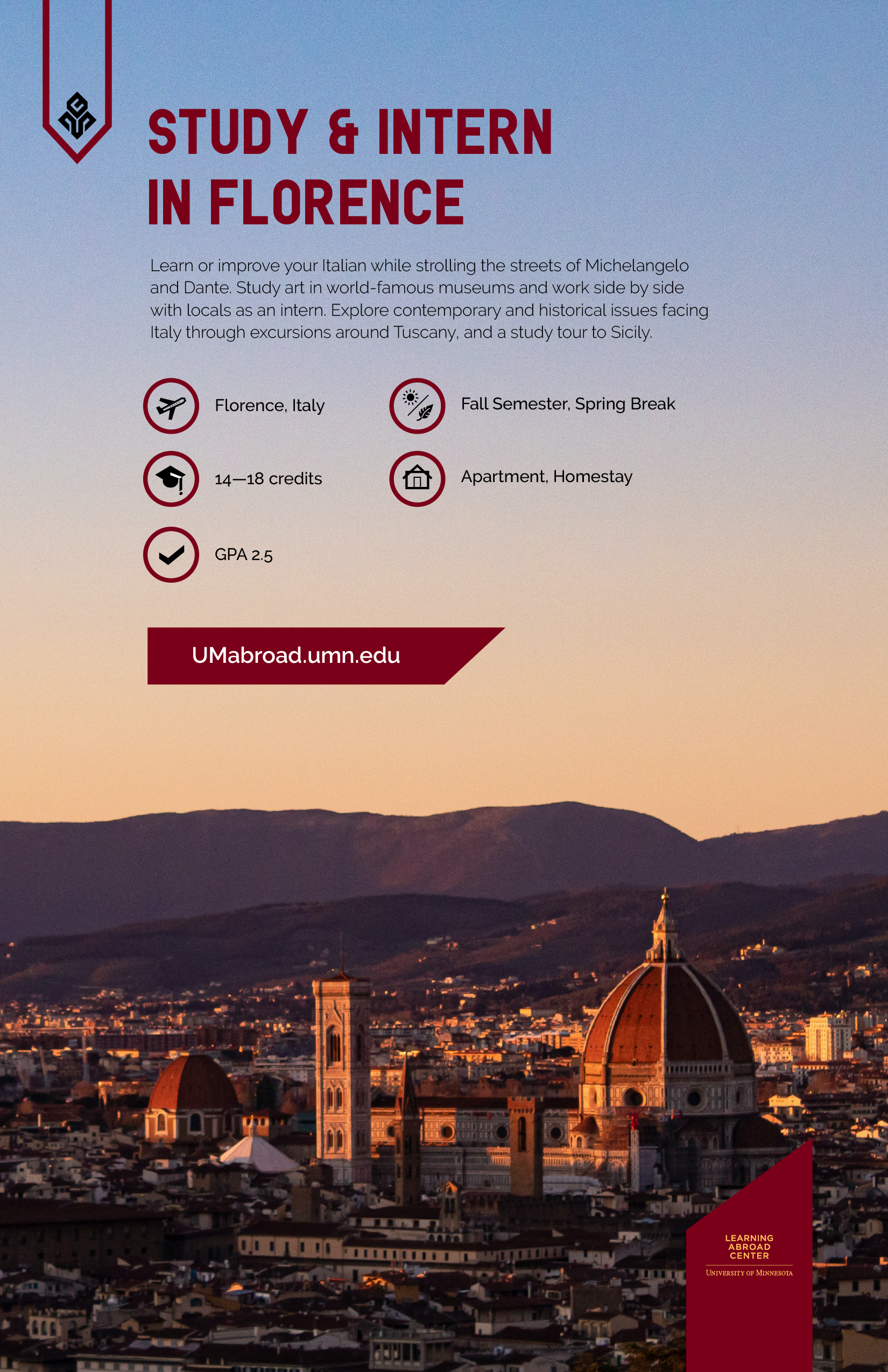
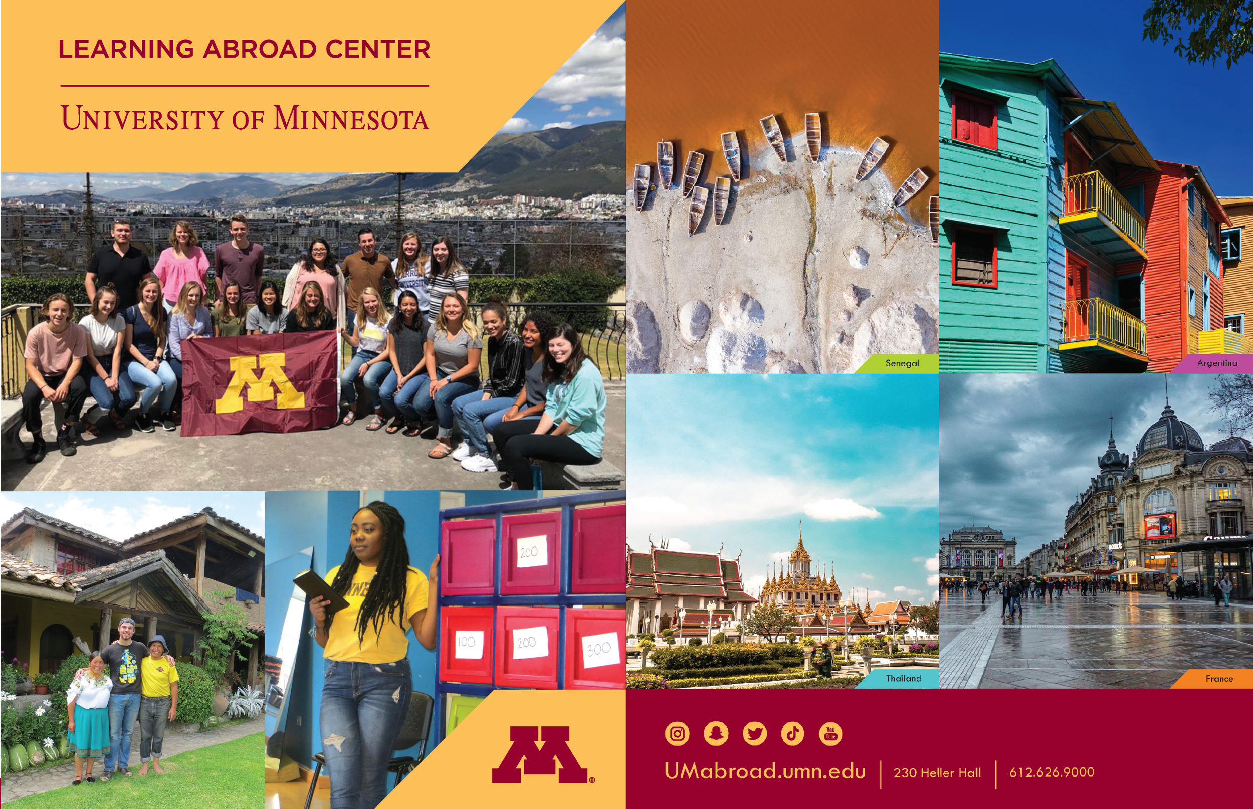
In 2015 I was hired as a lead designer to rebrand the Learning Abroad Center and enhance its relevance to the UofM student body. I wanted to give it a bold new look that would appeal to Gen-Z and make the office stand out from the myriad of services offered on the giant UofM campus.

unique look
Regional icons based on the region specific symbolism: Europe - Fleur de Lis, Asia - Yin Yang, Americas - Open Hand, Africa - Ram Horns,( Strength), Worldwide - Tree of Life.


connecting
I conducted a lot of research on Gen-Z , establishing key components that make them different from Millennials. My findings revealed that they like bold, authentic and unexpected.
Expansion
The angular design got carried over to other print materials. Below is a sample of icons used in our annual Catalog.
catalog
Annual catalog printed for UofM students


